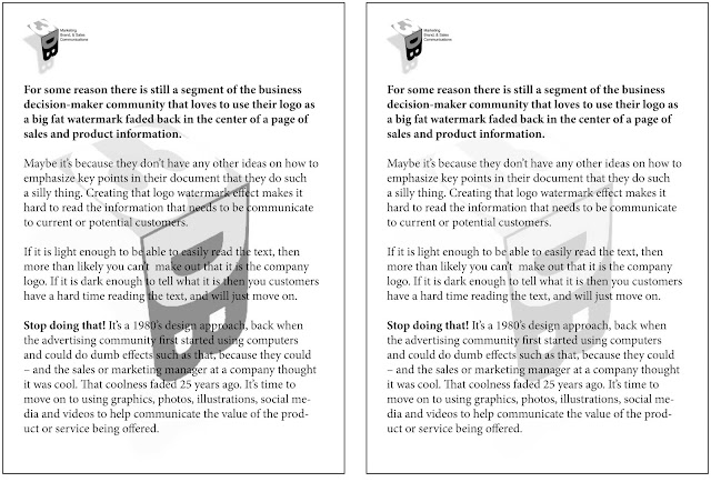
Warning! There is still a segment of the marketing/sales decision-making community that loves to use their company logo as a big fat watermark faded back in the center of a page of sales and product information.
So why is this such a Bad Idea?
Maybe it's because they don't have any other ideas on how to emphasize key points in their document that they do such a silly thing. Creating that logo watermark effect makes it hard to read the information that needs to be communicate to current or potential customers.
Stop doing that! It's a late1980's design approach, back when the advertising community first started using computers and could do dumb effects such as that, only because they could, and the sales or marketing manager at a company thought it was cool. That coolness faded 25 years ago, and it is time to move on to using graphics, photos, illustrations, social media and videos to help communicate the value of the product or service being offered.
The example on the left has a dark enough logo to be recognized for what it is, but it makes the text hard to read or annoying, and the prospective customer probably just moves on. The lighter logo watermark on the right, though being less intrusive, looses the "number 3" part of the logo. Either way, the reader's eye is drawn to this visual effect, versus drawing them into the content of the message, making this the worst design idea for using a company logo.


